Cosmetic Print Packaging Services
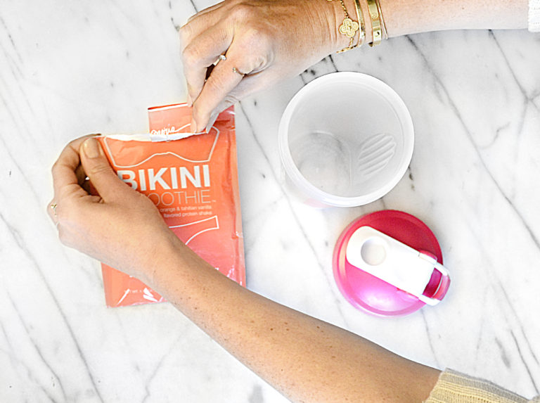
The following is a case study for one of SCG’s beauty and cosmetic packaging clientele. Bikini Cleanse. This customer was looking to find a reputable short-run packaging company. Prior to SCG, Bikini Cleanse was producing & manufacturing all of their cartons & cosmetic packaging offshore in China.
Print & Production Obstacles To Overcome
- Pricing: Producing a high end retail carton box while also offering competitive pricing on a short-run print job.
- Units & Qty: The jobs require a short-run production meaning with the limited number of units and all the specialty elements to the box, most people would assume it couldn’t be manufactured in Los Angeles.
Carton Packaging Print Services & Job Requirements:
- Die Cutting
- Foil Stamping
- Spot UV
- Soft Touch Lamination
- Gluing & Folding
- Multiple Versions Of Box
- Short-Run Qty: less than 1,000 units per design
- Create Die & Make Ready: Tooling & Make Ready
- Logistics: Turnaround time required less than 14 business days.
Southern California Graphics is a company with over 45 years of product packaging design and printing experience working with companies just like Bikini Cleanse, makers of Bikini Tea. How do we go from a weight loss tea product to a cool packaging solution that helps ensure the brand gets spread across social media and contributes to bikini bodies everywhere?
Packaging Design For Boxed Tea
In order to sell a product like Bikini Tea, it was important to look at the other products in the market and see what kind of packaging we were going to be competing with. Predominant colors were white, green, amber/gold, and pink. Packaging choices were split between packets and card boxes. Box design work tended to be not overly busy: some packaging didn’t even have an image of the product on it, which lines up with a trend in packaging design for beauty products more than for food and beverages. That was something we could work with though: the emphasis of the product is not on its natural ingredients or freshness or appealing appearance. The product’s purpose is to make people feel more attractive by helping them lose weight. With this principle in mind, we got to work on the graphic design for the branding and packaging.
Packaging for Wellness Products
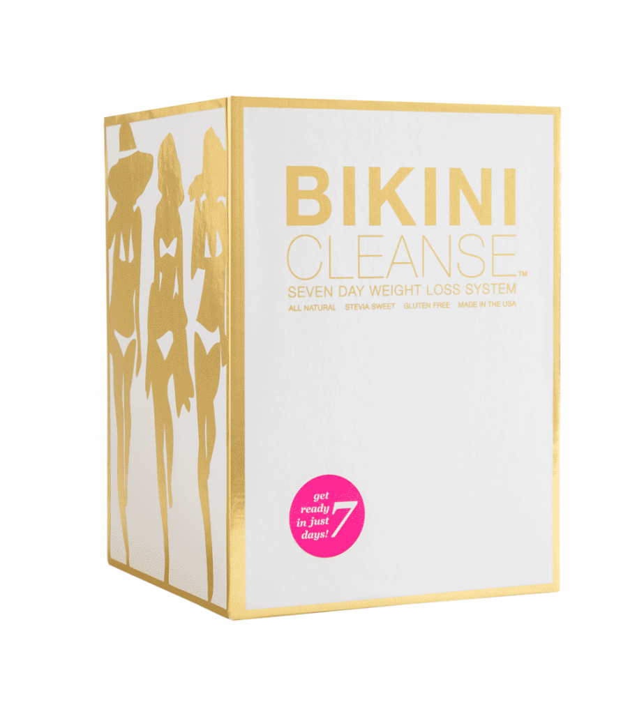
Detox teas tend to be simplistic and clean in their graphic design. We went for a solid block of color: warm pink, with white and gold as perennially fashionable accents that signify class and quality. In order for the product to jump off the shelves in comparison to its competitors, we decided to incorporate gold metallic foil on the packaging boxes.
Beauty Packaging
For this client we knew that it was important to reach beyond standard tea and beverage packaging. The product is promoting a lifestyle: a sexier, more glamorous lifestyle. We took cues from cosmetic packaging to find the right tone for the box art: sleek, stylized silhouettes of bikini-clad beauties in gold foil.
Packaging for Supplements
While obviously there is a difference between a weight loss tea and sports nutritional supplements, it is nevertheless important to consider label design and how it is possible to convey that the product has similar impact and effectiveness as a supplement while still enjoying an elegant, minimal design such as might be seen on the packaging of a skin care product. The tendency with supplements is to frontload a lot of information onto the packaging’s front. However, that amount of text on the Bikini Tea packaging would create a lot of noise that would distract from the effort to create a classy brand image. It is worth noting, though, that there is a tendency with supplements marketed to women to have cleaner, less dense packaging design. It was this aesthetic that we chose to emulate:
- Bold but not chunky upper-case lettering
- A single block of color instead of a varied palette
- Fewer details on the front-facing section of packaging